Redash Dashboard Usage Review
“Utilizing the open-source BI tool Redash, I visualized data and systematically managed dashboards to ensure easy access for various members of the organization. To improve accessibility and data literacy, I implemented management rules and actively used query parameter functions. This significantly increased Redash usage frequency, strengthening its role as the organization’s BI hub. (Approximately DAU
39%, WAU52%, MAU77%among all Redash account holders).”
| Performance Summary |
|---|
- Redash DAU: approx. 39% (compared to the total number of internal Redash account holders) |
- Redash WAU: approx. 52% (compared to the total number of internal Redash account holders) |
- Redash MAU: approx. 77% (compared to the total number of internal Redash account holders) |
Table of Contents
- Summary
- Introduction
- Background
- How I Used Redash
- Conclusion
1. Summary
Introduction
- At my company, a product data analysis environment is in place, and Redash has been used as a BI tool for nearly two years. In this post, I will share how Redash was implemented and utilized to enhance our data analysis environment.
Background
- The decision to implement Redash was driven by the following reasons:
- (1) High flexibility in data extraction.
- (2) It could be used without any additional costs due to its open-source nature.
How I Used Redash
- Organized dashboard names and tags to make navigation easier for users.
- Actively used query parameters.
- Added titles, a table of contents, and simple guides at the top of each dashboard.
- Positioned explanations on the left and the corresponding charts on the right.
- Wrote chart usage guides with the help of LLMs.
- Made subheadings larger and main headings smaller for clarity.
- Limited the display of charts with high cardinality categories to a maximum of 20 items, providing supplementary tables for the full data.
- Added hyperlinks for convenience.
- Stored all query scripts separately in a Git repository.
Conclusion
- Avoided creating dashboards mechanically, ensuring they provided real value to users.
- Delivered dashboards that were practically useful for team members.
- Significantly increased Redash usage, reinforcing its role as a BI hub in the organization (approximately DAU
39%, WAU52%, MAU77%).
2. Introduction
- At my company, a product data analysis environment is in place, and Redash has been used as a BI tool for nearly two years. In this post, I will share how Redash was implemented and utilized to enhance our data analysis environment.
3. Background
- The decision to implement Redash was driven by the following reasons:
- (1) High flexibility in data extraction.
- (2) It could be used without any additional costs due to its open-source nature.
Before hiring a dedicated data analyst, we were only using GA4 and Amplitude for basic data checks without any structured data catalog or event definitions, making data utilization difficult.
Upon joining as the company’s first data analyst, I set a goal of creating an environment with consistency and high usability within the first six months. This resulted in the establishment of a pipeline that enabled the organization to operate in a more data-informed decision-making environment than ever before.

In-house Data Pipeline
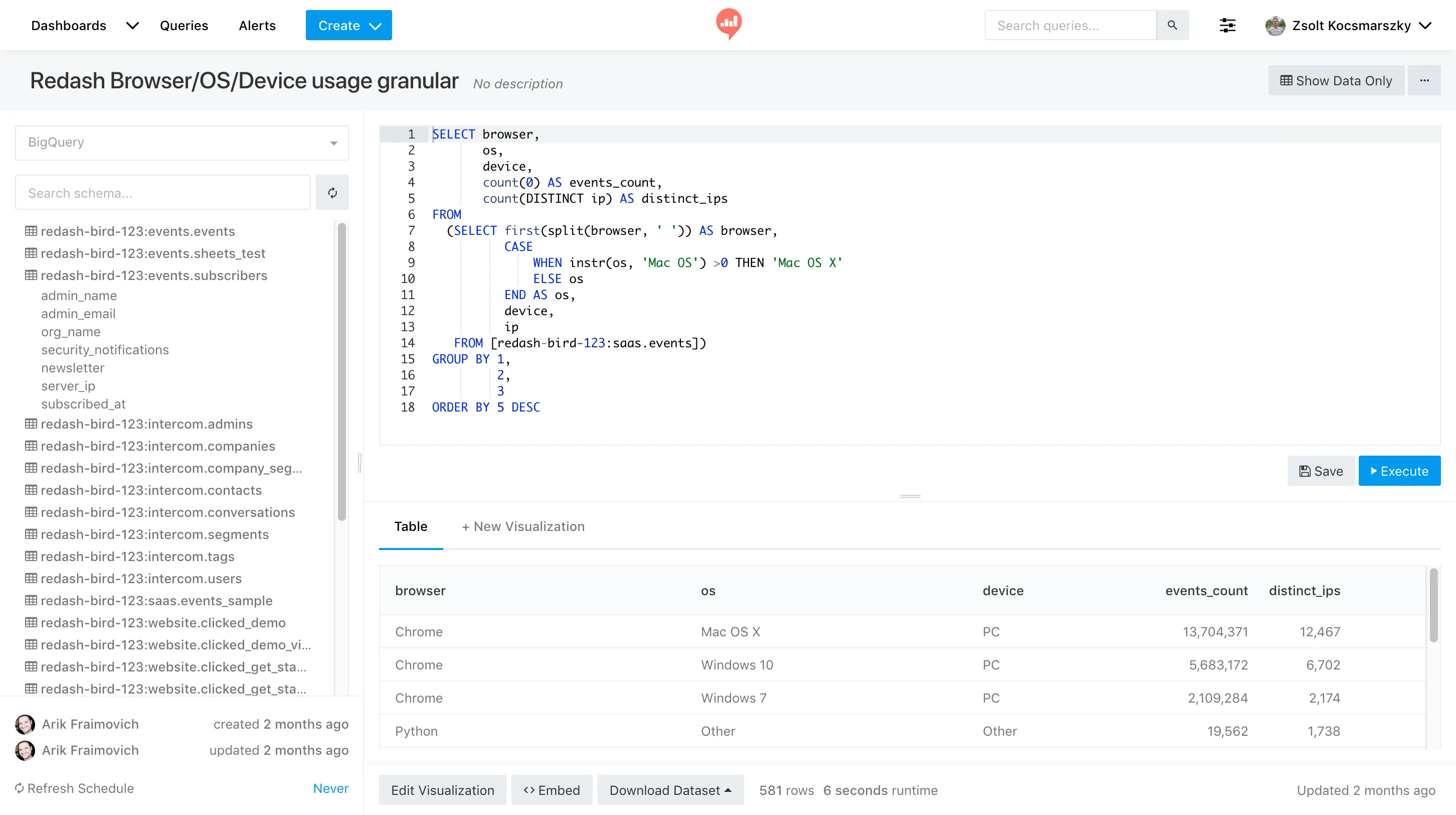
The final BI tool in this pipeline was Redash, chosen for the following reasons:
(1) High flexibility in data extraction.
Many data analysts agree that while no-code PA tools may be easy to use initially, as the depth of analysis increases, these tools limit analytical freedom.
However, Redash allows for writing custom queries and visualizing results based on flexible conditions and aggregations, making it an attractive choice for long-term use as the organization’s data-driven decision-making deepens.
(2) It could be used without additional costs due to its open-source nature.
By building Redash using Docker Compose, we could easily develop the Redash application without incurring extra costs beyond operating a VM instance.
4. How I Used Redash
- Organized dashboard names and tags to make navigation easier for users.
- Actively used query parameters.
- Added titles, a table of contents, and simple guides at the top of each dashboard.
- Positioned explanations on the left and the corresponding charts on the right.
- Wrote chart usage guides with the help of LLMs.
- Made subheadings larger and main headings smaller for clarity.
- Limited the display of charts with high cardinality categories to a maximum of 20 items, providing supplementary tables for the full data.
- Added hyperlinks for convenience.
- Stored all query scripts separately in a Git repository.
1. Organized dashboard names and tags to make navigation easier for users.
One of Redash’s limitations is the lack of a built-in feature to categorize dashboards into directories. Within our organization, dashboards are generally divided into two main types:
- Regularly followed general dashboards (general use)
- Ad-hoc dashboards created in response to specific analysis requests (one-time/specialized use)
As the number of dashboards with different purposes grows over time, it inevitably becomes difficult to navigate. This complexity hinders usability and eventually negatively impacts the organization’s data utilization and efficiency.
To overcome this, I adopted a method where dashboard names and tags were used to maintain ease of navigation.
(1) I applied the following prefixes to dashboard titles:
General-{Product Name}: General dashboards that team members regularly check.Ad-hoc: Dashboards summarizing specific analysis requests from individual team members.Private: Dashboards containing sensitive information, shared only with specific team members.Public: Dashboards made available for external purposes.
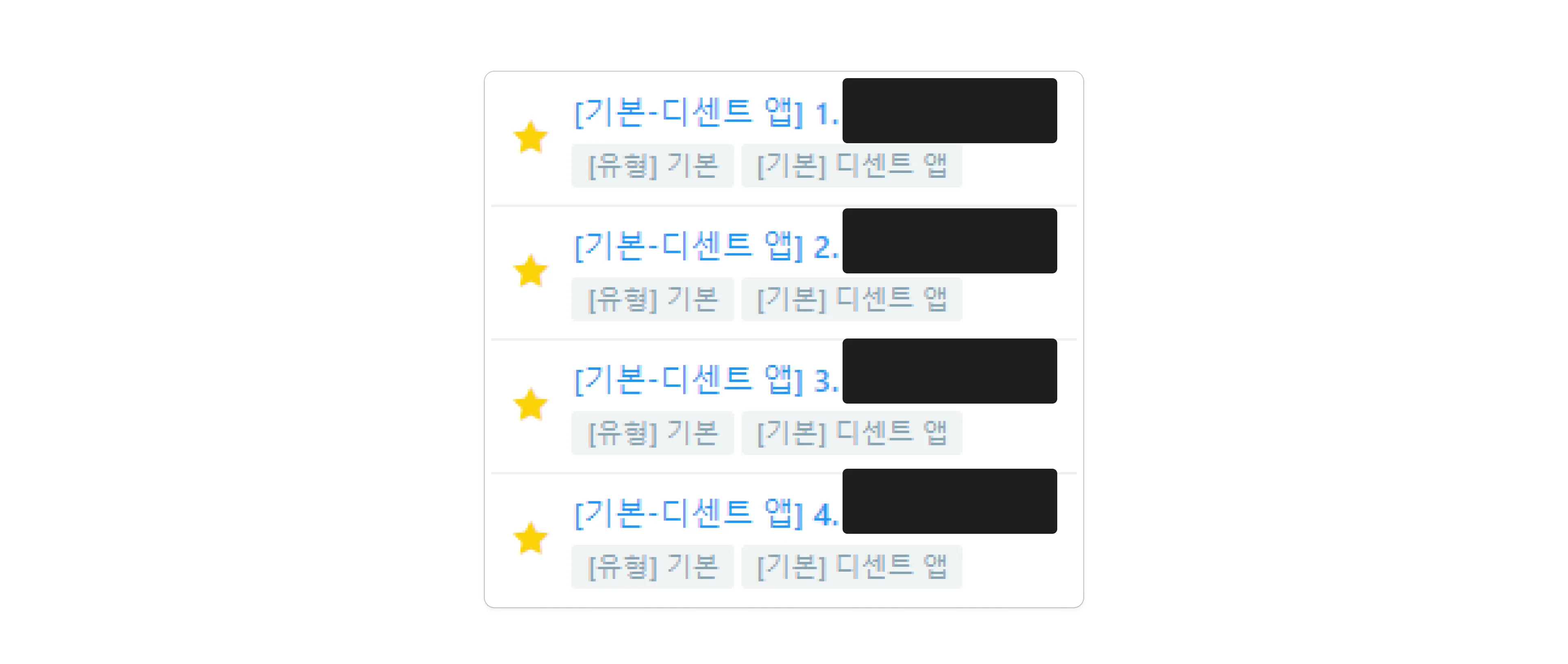
Sample of Internal Dashboards
(2) I applied two tags to each dashboard for easier filtering.
- Higher-level tags:
General,Ad-hoc,Private,Public. - Lower-level tags: Product name or the name of the team member who requested the analysis.

Sample of Internal Dashboards
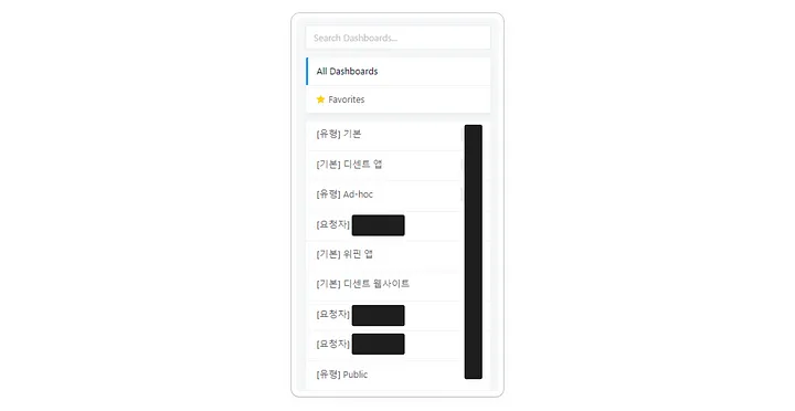
Clicking on the tags in Redash filters the list of dashboards for easier navigation.
2. Actively used query parameters.
Query Parameters in Redash are dynamic variables that allow users to select values and run queries directly from the Redash UI. This feature has several benefits:
- You can avoid creating individual queries for each case by changing the Query Parameters values at runtime to output the desired data.
- It improves dashboard visibility and prevents complexity by reducing the need to add charts for every individual case.
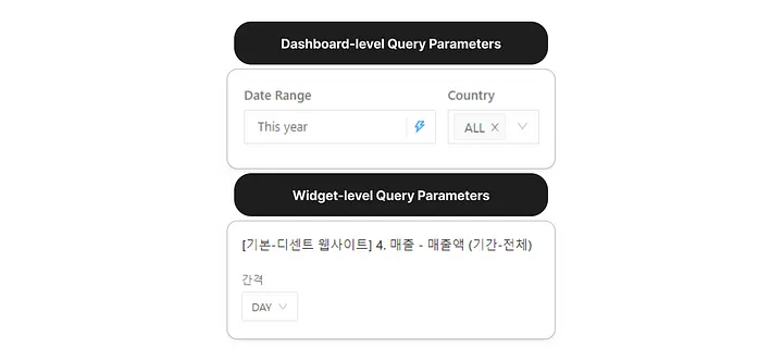
Query Parameters assigned to both dashboard and chart levels
Query Parameters can be categorized by Level and Type.
(1) By Level
- Dashboard-level parameters: Parameters applied to all charts in a dashboard.
- Widget-level parameters: Parameters applied only to the specific chart.
- Static values: Parameters fixed to a specific value.
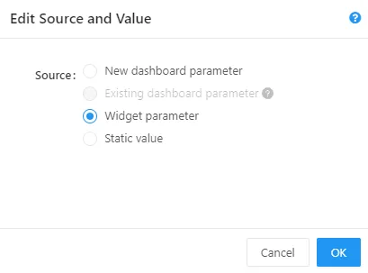
Setting the level of Query Parameters
(2) By Type
- Text: Users can freely enter text values.
- Number: Users can enter only numeric values.
- Dropdown List: Values are selected from a predefined list (static).
- Query-Based Dropdown List: Values are selected from the result of another query (dynamic).
- Date: Users can select a specific date.
- Date Range: Users can select a date range.
Now, let me introduce some of the key Query Parameters I used.
(A) Interval Parameter
The DATE_TRUNC() function’s interval in the query below is a dynamic parameter. This allows users to view aggregated results based on DAY, WEEK, MONTH, QUARTER, or YEAR.
    SELECT
        DATE_TRUNC(date, {{ interval }}) AS date,
        ...
    FROM
        ...
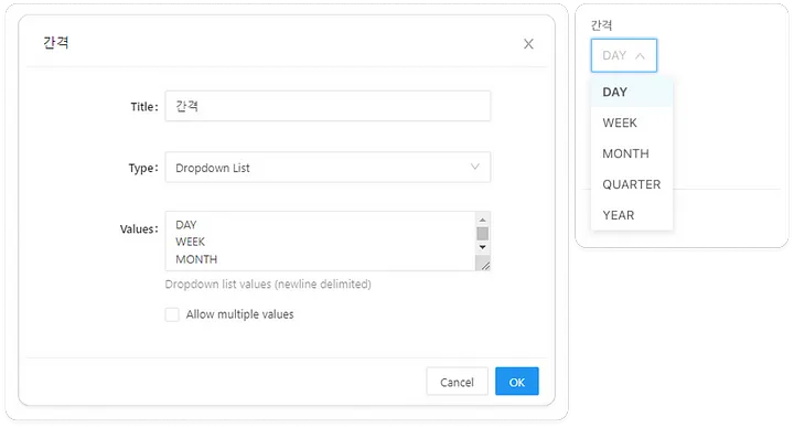
Interval Parameter
(B) Date Range Parameter
The following query uses the partition filter date to search only the desired partitions. This filter is parameterized, allowing users to select the date range they want to query.
- Static Range: January 1, 2024 to January 10, 2024
- Dynamic Range: This Week, Last Month, This Year, etc.
    SELECT
        ...
    FROM
        ...
    WHERE
        date BETWEEN '{{Date Range.start}}' AND '{{Date Range.end}}'
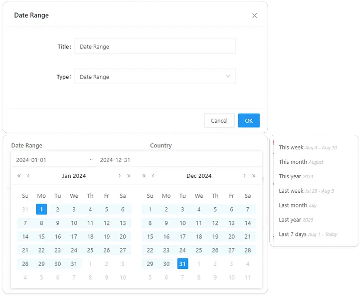
Date Range Parameter
(C) Country Parameter
For the country parameter, I used a Query Based Dropdown List. Since the number of user countries increases over time, maintaining a static list would be difficult.
- First, I created a query to dynamically retrieve the country list (sorted by traffic size and including an “ALL” option).
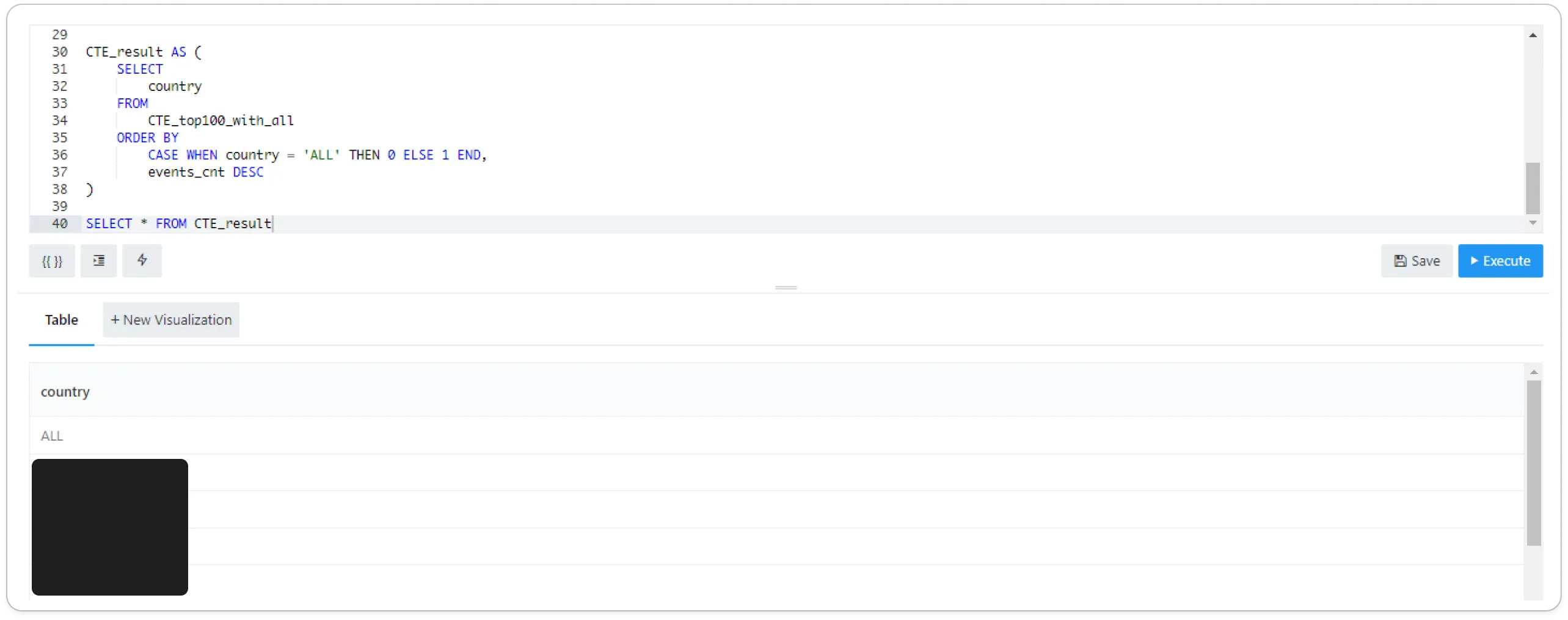
Saved query that only returns the country column.
- To maintain up-to-date information, I enabled Scheduled Runs to account for new incoming countries.
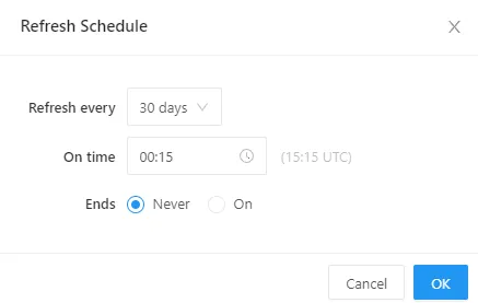
Enabling Scheduled Run
The query below outputs all data when ALL is selected for the Country parameter. If a specific country is selected, only the data for that country is shown.
    SELECT
        ...
    FROM
        ...
    WHERE
        ...
        AND CASE
            WHEN 'ALL' IN ({{Country}}) THEN 1 = 1
            ELSE country IN ({{Country}})
        END
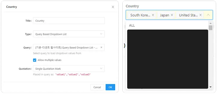
3. Added titles, a table of contents, and simple guides at the top of each dashboard.
Within the company, there are individuals who actively use data analysis in their work, while others may not be as deeply involved for various reasons. This could be due to the lack of relevance to their main tasks, time constraints, or difficulty in understanding data.
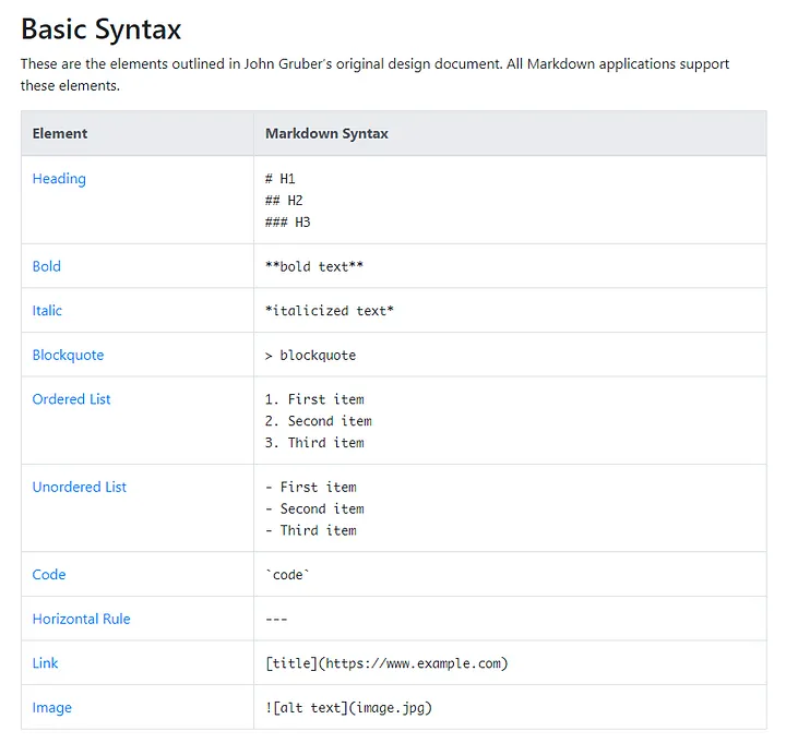
It was essential to provide dashboards that could be quickly and easily understood by as many team members as possible. To reduce any barriers, I added titles, a table of contents, and simple guides, as shown in the example below.
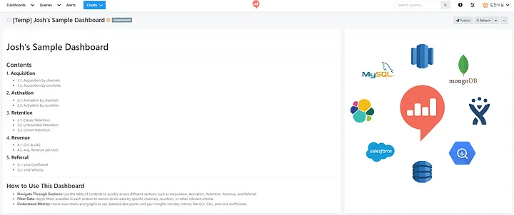
In Redash, you can freely add not only charts but also textboxes. By leveraging Markdown syntax, you can make content visually appealing and easy to read.
4. Positioned explanations on the left and the corresponding charts on the right.
As many designers and front-end developers know, languages like Korean and English are left-to-right (LTR) by nature (Apple Developer Guidelines). This means that people who use these languages tend to process text, numbers, and even images from left to right.

Mastering Front-End Development: Creating LTR/RTL Layouts - A Comprehensive Guide
To align with these cognitive patterns, I designed the dashboard layout as follows:
- Left 1/3 section: Titles, definitions, and detailed usage explanations for each chart.
- Right 2/3 section: Displays the corresponding charts or tables.
This layout follows the natural eye movement patterns of users.

Example of Internal Dashboard
5. Wrote chart usage guides with the help of LLMs.
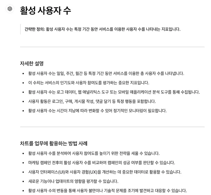
While data analysts are usually familiar with the meaning of the metrics shown on dashboards, explaining them clearly to non-technical team members can be challenging. This requires not only knowledge of various roles and responsibilities but also the ability to empathize and communicate across different levels of data literacy. To bridge this gap, I used LLMs (Language Learning Models) to create user-friendly UX writing for the dashboards.
(1) Sample prompt I used:
    Please write a usage guide for the "Active Users" chart.

    Context: This chart will be viewed by employees using the internal BI dashboard.

    Condition 1: Some employees may lack data knowledge, so the explanation must be clear and friendly.
    Condition 2: It should include connections to business strategy, marketing, design, and development.

    Format:
    # Active Users
    > Brief definition
    ---
    * 3-5 bullet points with detailed explanations
    ---
    * 3-5 bullet points with examples of how the chart can be used for work purposes
(2) ChatGPT 4o의 답변 사례
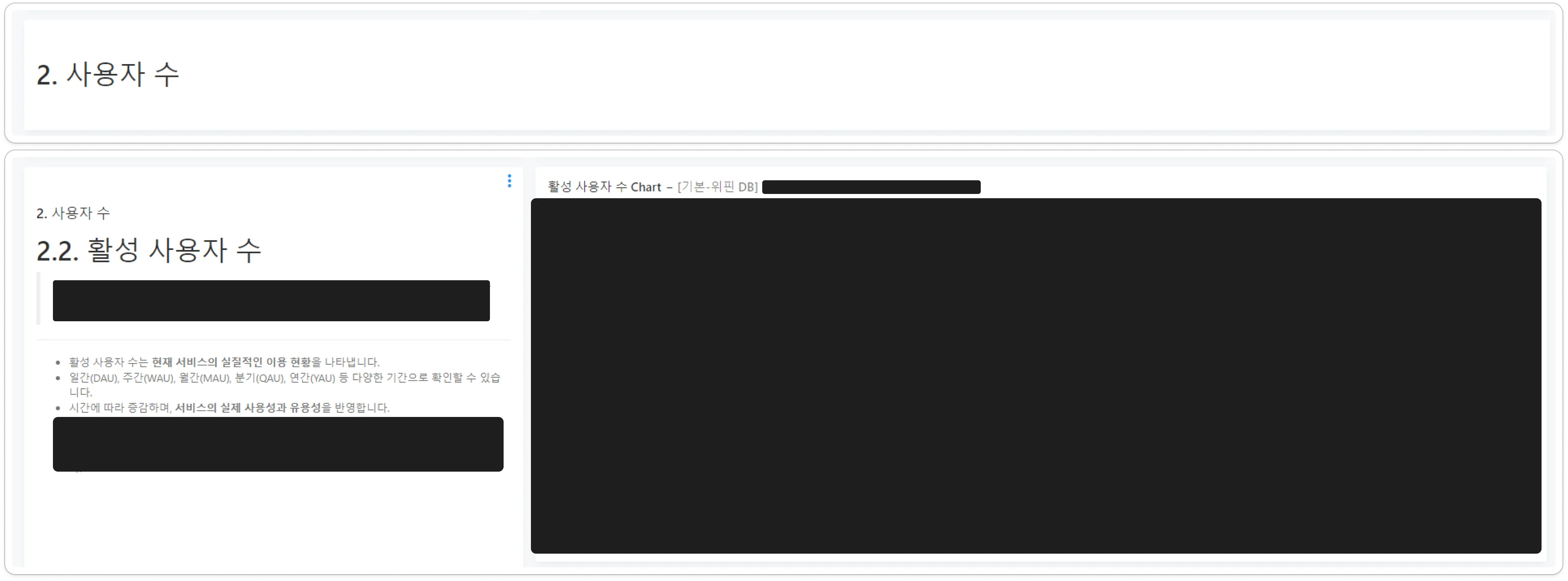
6. Made subheadings larger and main headings smaller for clarity.
Those familiar with Markdown usually format main headings as larger and subheadings as smaller, like so:
    # 1. Main Heading
    ## 1.1. Subheading
However, when subheadings contain a lot of content, this hierarchy can get lost as users scroll, leading to confusion. They might think:
“What was the main topic again?”
    # 1. Main Heading
    ...
    (several lines of content)
    ## 1.1. Subheading
    ...
    (several lines of content)
    ## 1.2. Subheading
To address this, I consulted with internal UX/UI experts, who advised:
“Since users will be focusing on the subheadings, it might be better to make subheadings larger and the main headings smaller to improve user experience.”
So, I adjusted the layout so that the subheadings are emphasized while still keeping the main heading in view, helping users stay focused on relevant content.
Example of Internal Dashboard
7. Limited the display of charts with high cardinality categories to a maximum of 20 items, providing supplementary tables for the full data.
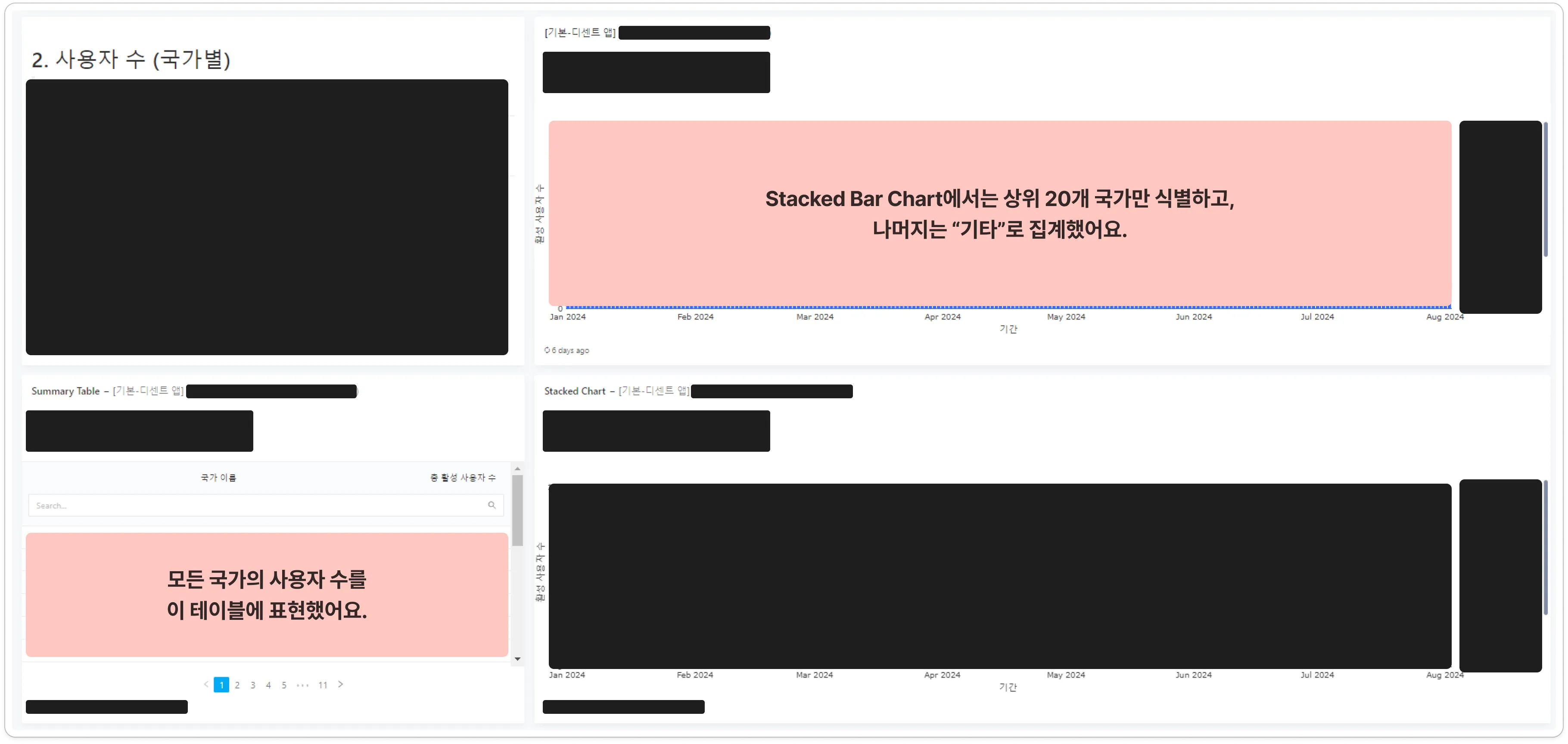
Since our company operates a global service, we have more than 100 countries where users are active. If we displayed the user acquisition trend by country on a chart, we would face two options:
(1) Show all countries.
- Pros: Completeness of information.
- Cons: Poor readability and high memory consumption in the browser.
(2) Display only the top N countries and aggregate the rest as “Others.”
- Pros: Improved readability and easier to grasp trends.
- Cons: The lack of detail for smaller countries might result in incomplete data.
To solve this dilemma, I chose the following approach:
- Limit charts to a maximum of 20 countries for readability.
- Provide a supplementary table with complete country data for comprehensiveness.
Example of Internal Dashboard
While it’s commonly recommended in the BI field to limit the number of categories displayed in a chart to 7, our company’s global nature led us to increase the limit to 20 to suit our needs.
8. Added hyperlinks for convenience.
In the content marketing domain, it is common to compare and analyze individual content pages. For these cases, I always added hyperlinks when creating tables that provide “per-page” insights.
From the perspective of a content marketer, it’s natural to review traffic, CTA conversion rates, engagements, and session duration alongside qualitative insights for each piece of content. Adding hyperlinks allowed users to quickly navigate to the relevant content pages for deeper analysis.

Example of Internal Dashboard
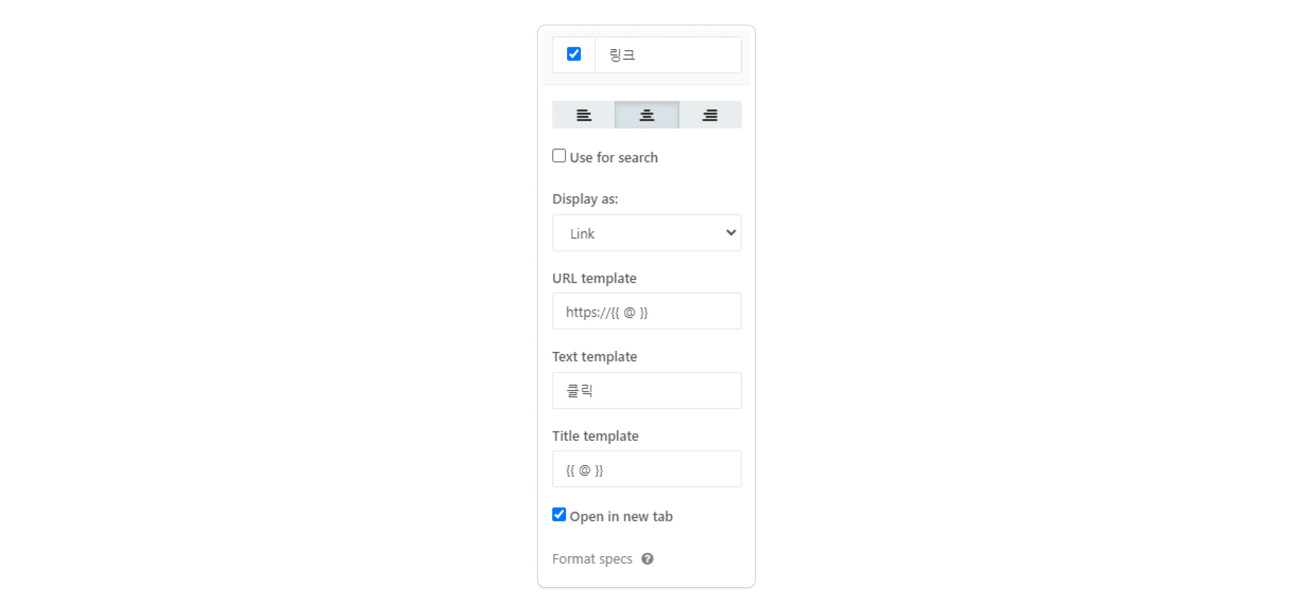
Hyperlink Option
9. Stored all query scripts separately in a Git repository.
Redash allows queries to be saved and categorized with tags for easier retrieval, much like dashboards.

Redash > Queries
However, as queries are reused or modified across dashboards, manually searching for specific queries becomes inefficient. Therefore, I implemented a system where all query scripts are managed separately in a Git repository:
- Directories: Correspond to individual dashboards.
- Files: Each file contains the query for a specific dashboard.
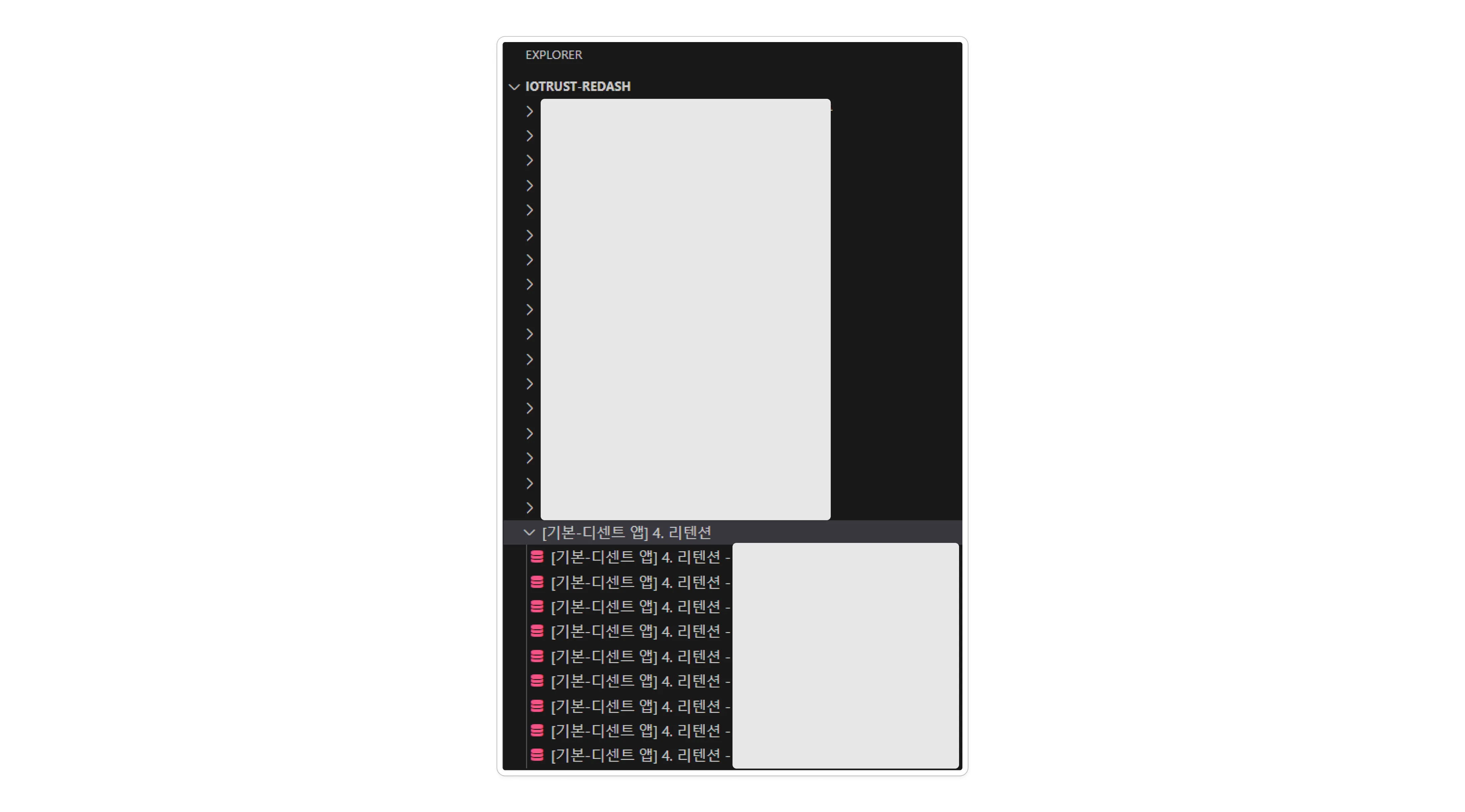
Internal Redash Git Repository
Using Git for query management has several advantages:
- When a major update, such as taxonomy changes, requires modifications to multiple queries, it significantly reduces the time spent on repetitive tasks.
- When creating new dashboards, reusing queries shortens the search time.
- The VS Code Copilot feature for code generation can further accelerate the work process.
5. Conclusion
- Avoided creating dashboards mechanically, ensuring they provided real value to users.
- Delivered dashboards that were practically useful for team members.
- Significantly increased Redash usage, reinforcing its role as a BI hub in the organization (approximately DAU
39%, WAU52%, MAU77%).
In conclusion, I shared how Redash was utilized within my company. Throughout this process, one critical insight emerged: avoiding mechanical dashboard creation is key. In order to contribute to data-driven decision-making and data literacy, it is essential to continuously ask questions like:
“How can we design dashboards that maximize the effectiveness of decision-making and data utilization?”
While sophisticated and complex charts are valuable, the ultimate goal should be to deliver dashboards that are truly helpful for team members. This mindset drove me to study user psychology and apply LLMs in the process of building Redash dashboards.
I do not consider the current dashboards to be perfect. As business strategies, data, and organizational growth evolve, there will be opportunities to improve them. I plan to maintain a strong focus on BI, striving to continuously improve and contribute to creating a product loved by customers.
Published by Joshua Kim
